A bilingual, multi-specialty site that has to earn trust twice.
Noor Al Mamzar runs dental, laser hair removal, dermatology, and plastic surgery under one roof, for a Dubai audience that moves between Arabic and English day to day — a different brief from a single-language clinic. Every heading, stat, and call to action needs to carry the same confidence in both directions, not read like a translation bolted onto an English layout.
The scope was design only: a system fully specified in Figma for another team to build, with no chance to sit through development and catch the small stuff — which pushed more of the decision-making into the file itself than usual.
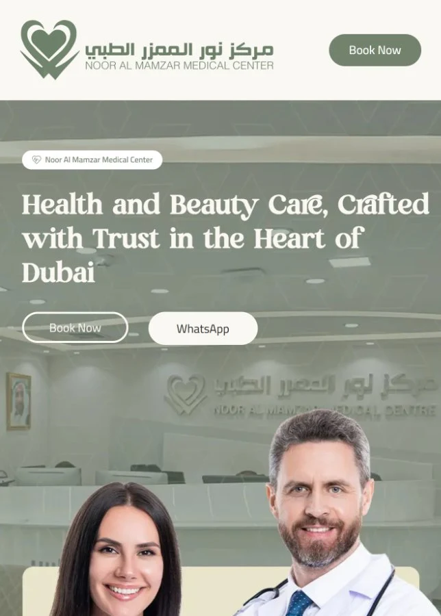
Put the proof and both ways to act before the scroll.
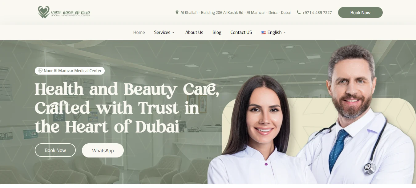
With four specialties and two languages competing for the same header, the hero had to do three jobs at once: say who the clinic is, show the numbers that back it up, and offer both ways to get in touch — without turning into a wall of competing claims.
Bilingual by design, not by default
rh zak font for Arabic headings and Mirado for English ones are matched in weight and size, so the Arabic version never reads like a translated afterthought.
Numbers before claims
The 100,000+ patients, 10,200+ surgeries, 53 doctors, 15 years strip sits directly under the hero, ahead of any service description.
Both CTAs live in the hero
Book Now and WhatsApp sit side by side under the headline, so a visitor who's already decided doesn't need to scroll to find either path.
A sage-and-cream palette, warmer than the clinical blues this category defaults to.
Instead of the brighter clinical blue-greens most other practices in this category use, the identity leans on a muted sage green against a warm cream surface — closer to a wellness-spa palette than a hospital one, while still reading clean against the near-black ink used for body copy.
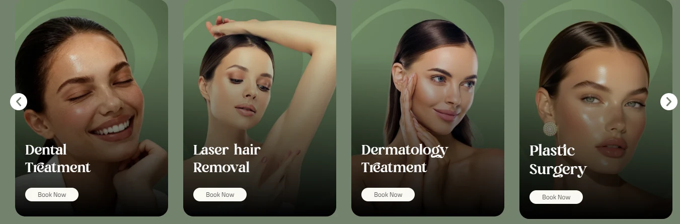
The palette stays narrow — one sage ground, one cream surface, three supporting greys for hierarchy — so four very different treatments, from dental to plastic surgery, can share it without any one needing its own color story.
EN Heading
Mirado
EN Body
Cairo
AR Heading
rh zak font
AR Body
Cairo
One continuous photo splits in two; on mobile, it becomes two separate portraits.
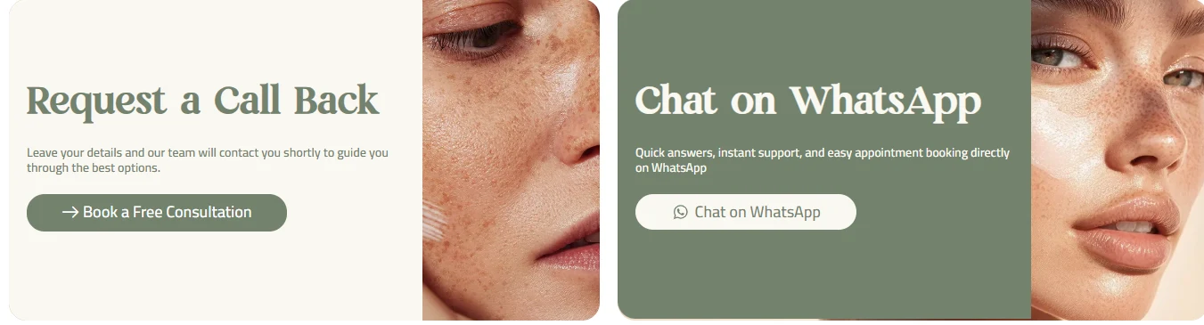
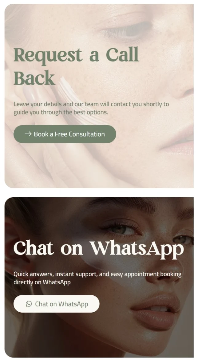
On desktop, the "Request a Call Back" and "Chat on WhatsApp" cards sit side by side over a single continuous photograph that runs behind both of them — one image doing double duty for two different calls to action. On mobile, that photo isn't just resized: it's replaced with two independently cropped portraits, each toned to match its card — a warm, light crop behind the call-back form, a darker, moodier crop behind WhatsApp — a deliberate rebuild for the stacked layout, not a shrunk version of the desktop photo.
Delivered as a build-ready system, not a set of screens.
With no WordPress or Elementor build in scope this time, the deliverable was a fully specified Figma file: component variants for every repeating pattern — the stat tile, the service card, the two-CTA hero — both language directions laid out side by side, and type, spacing, and color documented as reusable tokens, so a separate development team could build it without needing to guess.
A few calls that read as UX decisions, not decoration.
Looking back at it with a UX eye, three decisions do more work than they look like they do:
A bilingual system, not a translated one
rh zak font and Mirado are paired to match in weight and proportion, so switching languages doesn't also feel like switching sites.
A question mark as a visual device
The "Why Choose Noor Almamzar" heading uses an oversized decorative question mark behind a pill-highlighted "Choose" — a stock section heading turned into a specific, ownable piece of the identity.
One photo template for every doctor
Every portrait in the "Meet Our Expert Team" carousel uses the same green-tinted studio treatment, so a bench of individually shot doctors reads as one consistent, art-directed team.
Two calls to action, repeated — never a third competing with them.
Book Now and WhatsApp stay the only two actions across the page — repeated at the hero, after the services carousel, and again in the dedicated call-back section — rather than being joined by a third or fourth competing CTA, so the decision stays binary wherever a visitor lands.
One clinic, reading the same in two languages.
Whichever language a visitor lands in, the same stat strip, the same two-CTA pattern, and the same warm sage identity carry through — specified as one bilingual system in Figma rather than two language versions to keep in sync by hand.