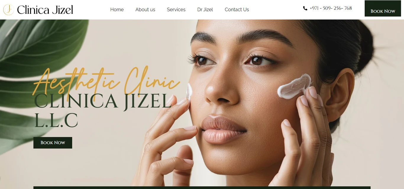
Seven specialties, one clinic that still has to feel luxury.
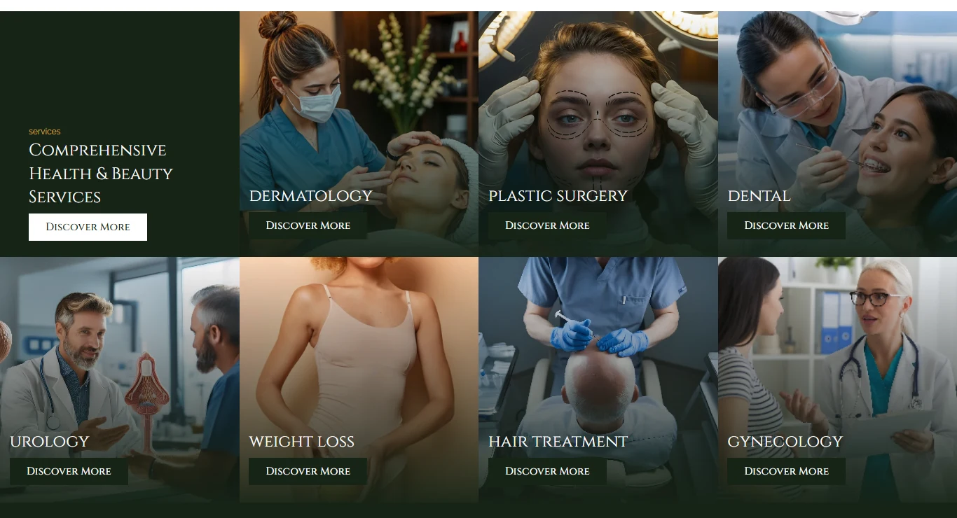
Clinica Jizel runs dermatology, plastic surgery, dental, urology, weight loss, hair treatment, and gynecology — a wider spread than a typical aesthetic clinic, and an easy way to end up looking like a generic multi-department directory instead of a single premium practice.
The brief was to keep every specialty equally easy to find, without losing the boutique, editorial feel the clinic's own branding and photography already had.
Let the photography carry the trust, not icons or copy.
With seven services competing for attention, the fastest way to flatten them into a directory would have been icon tiles and short labels. Instead every specialty got a full, real clinical photograph — the treatment itself is the pitch — with practical information (location, hours, phone) placed before any persuasive copy, for visitors who already know they want to book.
Photography first
Seven specialties, seven real photographs — no icon set standing in for the work itself.
Practical info, fast
Contact, location, and hours sit directly under the hero, before a single line of marketing copy.
Two-step trust
A hard numbers strip (patients, doctors, surgeries) followed by a numbered "why choose us" — proof, then reasoning.
A deep green and gold palette, read as a beauty editorial, not a clinic.
The identity leans on a near-black forest green with a single gold accent, paired with a serif display face for headlines over a plain sans body — the same contrast a beauty magazine spread uses, rather than the brighter, more clinical palette most of the other practices use.
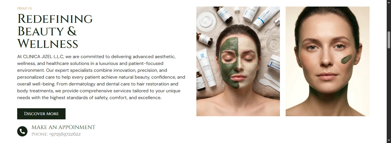
The palette stays deliberately narrow — one dark ground, one warm accent, one supporting neutral — so seven very different specialties can share it without any one of them needing its own color story.
EN Heading
Playfair Display
EN Body
Poppins
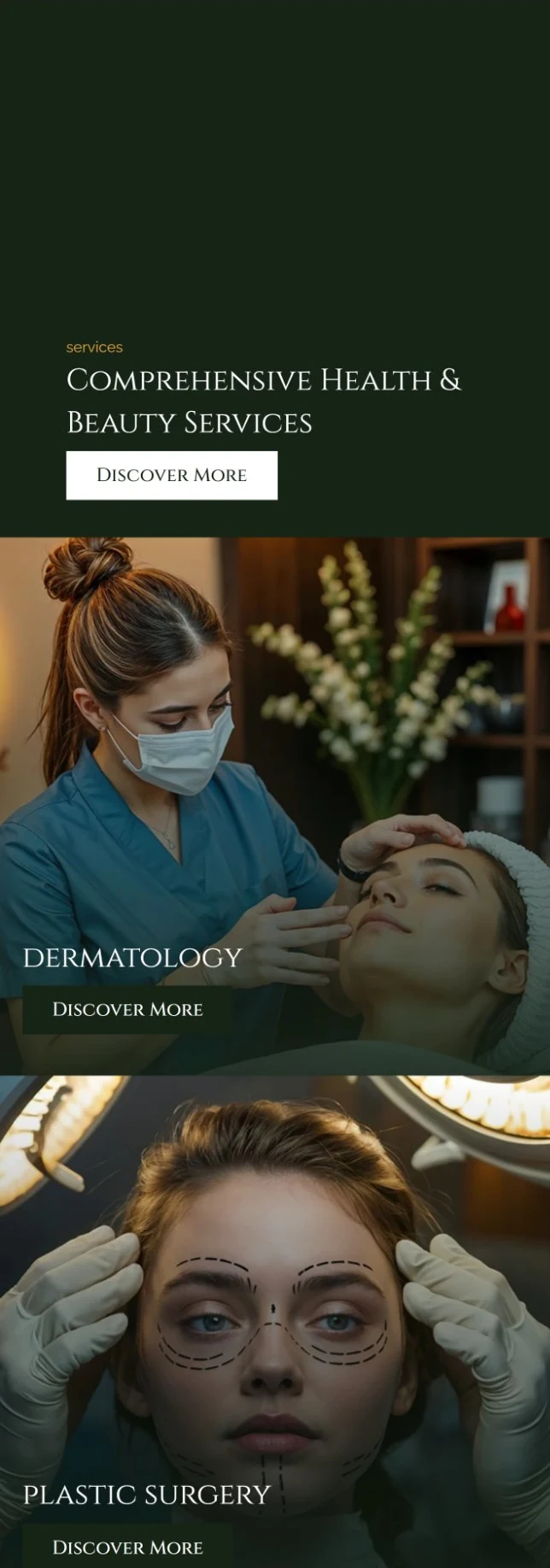
A grid on desktop becomes a full-bleed scroll on mobile.
On desktop the seven specialties sit in a dense four-column grid next to an intro tile, scannable as a whole. On mobile that grid unfolds into a single column of full-bleed photo cards, one after another — each treatment gets the entire screen width instead of being shrunk into a grid cell too small for a real photograph to read.
Built solo, in WordPress and Elementor Pro.
I designed and built this end to end. The service card, the stat tile, and the numbered "why choose us" row are each a saved Elementor section, so the same seven-specialty structure is reusable for any future clinic with a similar multi-department spread — duplicate the row, swap the photograph and the label.

A few calls that read as editorial, not generic.
Looking back at it with a UX eye, three decisions do more work than they look like they do:
Info before intent
Contact, location, and hours sit in their own bar directly under the hero image, before any pitch — a visitor who already means to book gets what they need without scrolling past marketing copy first.
No icons, only photography
All seven specialties use a full-bleed clinical photograph with a gradient overlay, never an icon tile — consistent with a luxury, aesthetic-led clinic where the visual quality of the work is itself the proof.
A watermark, not a divider
The oversized, faint "Why Choose Us" script sits behind the section as background texture rather than a rule or icon — it marks the section visually while leaving the numbered list all the room to breathe.
The homepage's job is to earn the click, not carry the whole story.
Each of the seven specialty cards leads to its own "Discover More" page, and that's deliberately where the procedure-specific detail, before/after work, and FAQs belong — keeping the homepage fast to scan for someone who hasn't decided which specialty they need yet.
Seven specialties, read as one place.
A visitor can land on any of the seven specialties and find the same palette, the same card shape, and the same two ways to act — book now or call — with the clinic's real location and hours never more than a glance away.