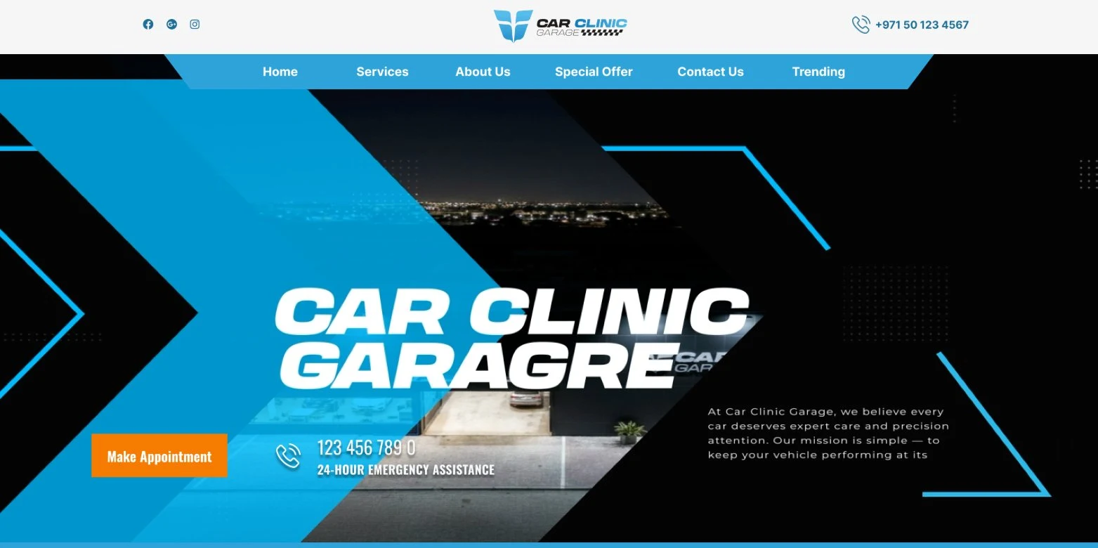
A high-trust service that still needs to feel exciting.
Car Clinic Garage works on everything from everyday runabouts to Lamborghinis, Bentleys, and Aston Martins — a brief that has to read as technically credible to someone handing over a luxury car, while still carrying the energy of a performance brand rather than a dry service directory.
The scope here was UI/UX design in Figma.
Prove the garage before anyone reads a service list.
For a workshop that works on six and seven-figure cars, the trust problem comes before the service problem — a visitor needs to believe the garage is capable before they care what's on the price list.
Brand logos as instant credibility
A row of the marques the garage services — Lamborghini to Mercedes — sits directly under the hero, before any service copy.
Numbers plus a real gallery
Stat cards (1000+ services, 2500+ clients) are backed by an actual facility photo grid, not just claims on their own.
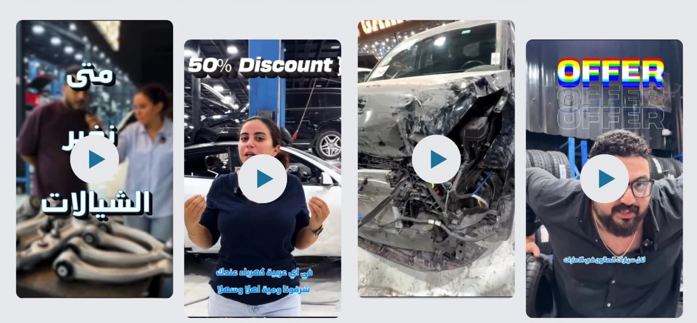
Video where the audience already is
Short-form clips — promos, a 50% offer, a crash-repair before shot — sit natively in the page grid, in the vertical format people already watch.
A two-blue system — bright cyan for energy, ink blue for authority.
A bright sky-cyan carries the nav bar, the hero's diagonal accent shapes, and the active service tab — the color doing the "fast, modern, technical" work. A darker ink blue carries buttons, stat numbers, and the footer — the color doing the "established, trustworthy" work. One orange accent is reserved for the single most important action: booking an appointment.
The palette stays disciplined for a busy, photo-heavy page — two blues, one black, one orange, two neutral surfaces, and a supporting text grey — so hero, stats, gallery, and video sections all read as one site.
EN Heading
Anton
EN Body
Poppins
Colors and type sampled directly from the live site — no source files were provided for this project.
The hero's CTA bar becomes a location bar.
On desktop, the bar under the hero headline pairs the "Make Appointment" button with the emergency phone line — a conversion-first pair for a visitor who's already decided. On mobile, that same bar drops the button and leads with the garage's address instead, still next to the phone number — a different first priority for someone more likely to be searching "car garage near me" and deciding whether it's worth the drive.


Delivered as a build-ready system, component by component.
The deliverable was a fully specified Figma file: the vertical service-tab component, the stat tile, the brand-logo strip, and the native video-grid pattern each handed off as a reusable block, so a separate development team could assemble the page without guessing at spacing or states.
A few calls that read as deliberate, not decorative.
Looking back at it with a UX eye, three decisions do more work than they look like they do:
Two blues doing different jobs
Bright cyan carries energy in the hero and nav, ink blue carries authority in buttons and stats — one color isn't asked to do both.
Serviced marques before a service list
The brand-logo trust strip sits between the hero and About, ahead of any service copy — credibility established before the pitch.
Native video, not a social embed
The four vertical clips sit in the page's own grid with their own play buttons, so a visitor watches without leaving to open an app.
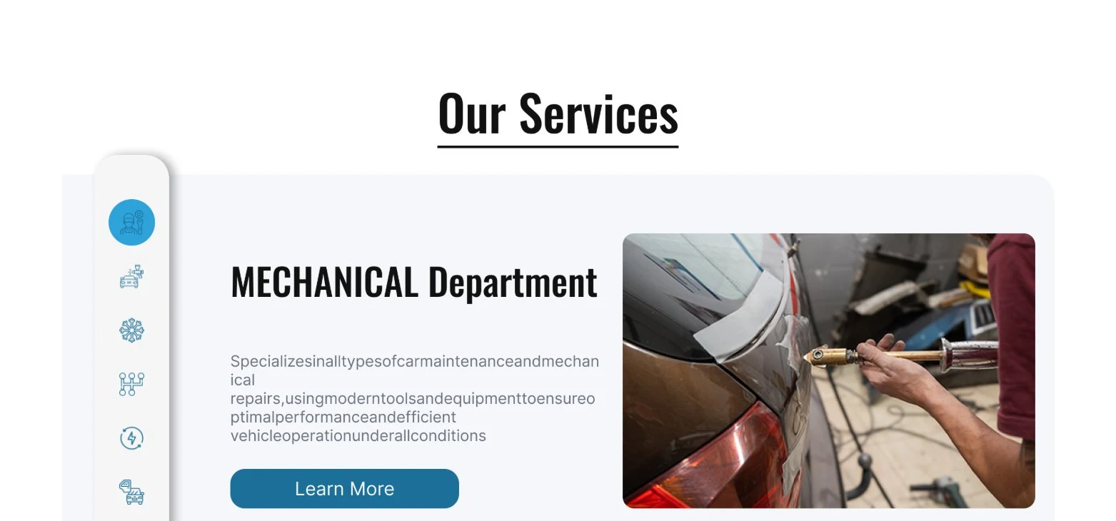
One tabbed panel instead of six separate service pages.
"Our Services" uses a single vertical icon-tab panel that swaps its content pane in place, so a visitor can compare Mechanical, Bodywork, AC, Transmission, Electrical, and Detailing without a page reload for each one.
A specialist garage that still looks built for supercars.
Whichever section a visitor lands on, the same cyan-and-ink-blue system, the same bold condensed headline treatment, and the same photo-and-video proof carry through — a trust-first service business with a performance-brand energy.